New Year, New Color
A belated Happy New Year to everyone! 2014 was such an exciting year for our business and for me personally. We saw a substantial increase in business and received some great feedback and referrals from our clients. I also got to spend some quality time with my wife and our 16-month-old daughter. Everyone told me how fast they grow up and boy, they weren’t lying. I can’t believe she’s not a little baby anymore. She’s up and walking and taking over the world (aka our house)!
With a great 2014 behind us we are super excited for everything 2015 has to bring. I thought I would share with you 3 colors that are going to be very relevant going forward.
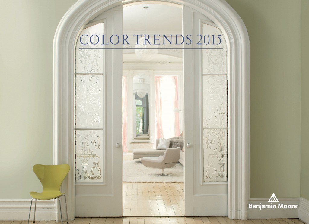
First up: Benjamin Moore Guilford Green

I had a little help with this one because Benjamin Moore picked it as its color of the year for 2015. I really think this color is perfect because it works in any room. As Ben Moore creative director Ellen O’Neill says, “It’s a neutral that’s natural. A silvery green that works with, well, everything.” I couldn’t agree more. It’s a neutral color that separates itself from the classic beiges, whites, and grays. I think this color would be perfect at an entryway or kitchen space. It connects you with the openness of the outdoors. Check out Benjamin Moore’s site for more colors in the Guilford Green pallet: www.BenjaminMoore.com
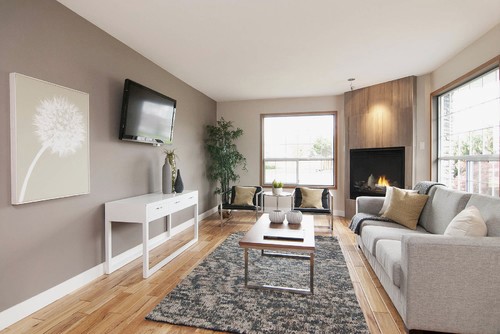
Next up: Sherwin Williams Functional Gray

I chose Functional Gray because I think it best represents gray being the new popular neutral over beige. This was a huge trend in 2014 and it’s not going to stop anytime soon. Gray really works with everything and it’s no longer seen as drab or gloomy. Just take a look at the picture above and tell me you’re not in love. Take a look at some more colors from their Pottery Barn collection: www.SherwinWilliams.com
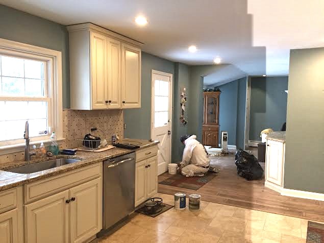
Lastly: Behr Neptune Blue

So, admittedly I’m not a huge fan of their paints but I do love this color. Actually, I picked this color because we just painted an open kitchen/dining space with it. That’s Miguel in there doing a final inspection. Neptune Blue is a neutral and keeps the space open but still has a lot of depth.
Don’t forget, we’re here to help you in the color selection process. Don’t stress…2015 is going to be a big year. Let’s get painting!
-Matt


